
Facebook and Instagram Ad Sizes (2026)
Every Facebook and Instagram ad size for 2026: feed, Reels, Stories, carousel, and Marketplace ratios, resolutions, file caps, text limits, and the unified safe zone.
Updated July 2026 · Likit Sae Lee, CTO
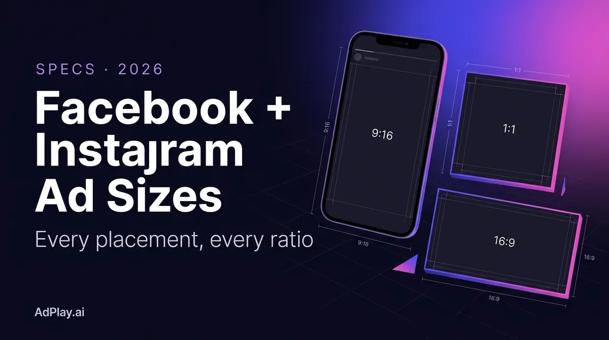
Per Meta spec in 2026, Facebook and Instagram feed ads run square 1:1 at 1440 x 1440 pixels or vertical 4:5 at 1440 x 1800, while Reels and Stories ads run full-screen 9:16 at 1440 x 2560. Images upload as JPG or PNG up to 30 MB; video uploads as MP4 or MOV up to 4 GB with H.264 compression. Since March 2026 every vertical placement shares one safe zone built to the tightest of them, Reels: keep text and logos out of the top 14%, the bottom 35%, and 6% on each side. Three masters (1:1, 4:5, and 9:16) cover every placement on both platforms.
You built the creative, the offer is sharp, and then the launch stalls on a rejected upload, or worse, the ad runs with its headline hiding behind a Reels caption. Sizing is the unglamorous half of Meta advertising, and it shifts often enough that last year's cheat sheet quietly goes stale. This page lists every Facebook and Instagram placement spec as Meta documents it in 2026: ratios, resolutions, file types and caps, video length bounds, text truncation points, and the safe zones that keep your message visible. Build to it once, then spend your attention on the part that actually wins auctions: the creative.
Three masters cover every placement
Meta's placement list looks long, but the sizes resolve into three canvases. A square 1:1 at 1440 x 1440 pixels, a vertical 4:5 at 1440 x 1800, and a full-screen 9:16 at 1440 x 2560 cover everything Facebook and Instagram will sell you (per Meta spec, 2026). Images upload as JPG or PNG with a 30 MB ceiling. Video uploads as MP4 or MOV (GIF works on several placements) with a 4 GB cap, H.264 compression, square pixels, a fixed frame rate, progressive scan, and stereo AAC audio at 128 kbps or higher.
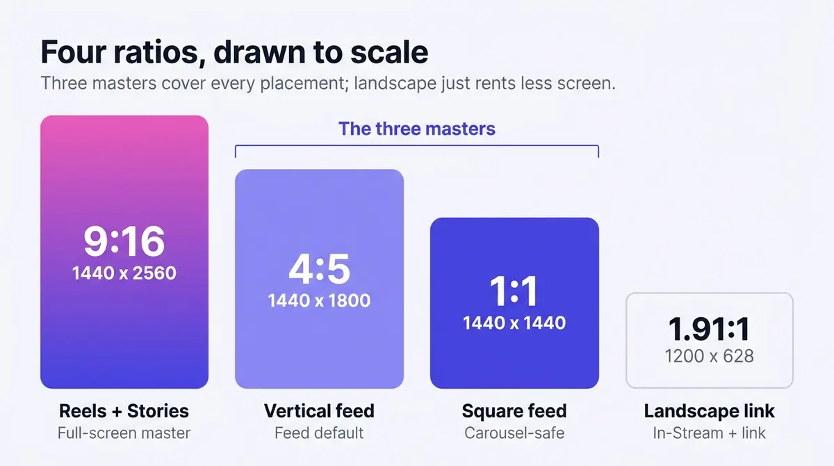
Design the 9:16 master first. It carries Reels and Stories, the two placements with overlay hazards, and cropping down to 4:5 or 1:1 is far cleaner than stretching a square up to full screen. One sign of where Meta is heading: its 2026 guidance recommends 9:16 at 1080 x 1920 even for Instagram feed video, which puts the feed and Reels on the same canvas.
Why vertical and square beat landscape on mobile
The reason every ratio recommendation tilts taller is screen real estate, and the gap is not marginal. A square 1:1 video occupies roughly 78% more space in a mobile feed than the same clip in 16:9 landscape, because the wide format wastes the left and right edges of a portrait phone (Buffer, 2025). A 4:5 vertical wins even more, and 9:16 takes the entire display. The audience is overwhelmingly mobile-first: in 2026 there are 5.79 billion active social media user identities, 69.9% of the world's population, and Facebook reaches 56.3% of internet users aged 16 and over while Instagram reaches 54.6%, almost all of them through a phone (DataReportal, 2026). That is why a landscape ad pays for a slot it only half fills, in a smaller, easier-to-scroll-past thumbnail, while a vertical asset rents the whole screen for the same impression cost.
That is the lever behind the spec. Landscape is not banned: a 1.91:1 link image still runs in the feed and an In-Stream ad is happiest at 16:9. But on the placements that decide most budgets, taller creative buys more attention per impression at no extra media cost. Treat 4:5 as the feed default, 9:16 as the full-screen default, and reserve 16:9 for In-Stream.
Real ad examples illustrate the split well. A representative Shakura ad, before-and-after creative for stubborn dark spots faded without laser at RM68 for two sessions, runs in the 4:5 feed frame, where the taller canvas gives a comparison room to breathe. Skinlycious takes the full-screen lane instead: a testimonial of a mum on her daughter's forehead pimples clearing, shot as 9:16 video for Reels. Two brands, two canvases, each composed for the placement it buys.
Facebook ad sizes in 2026
| Placement | Ratio | Recommended size | File types | Caps and bounds |
|---|---|---|---|---|
| Feed image | 1:1 or 4:5 | 1440 x 1440 or 1440 x 1800 | JPG, PNG | 30 MB, min width 600 px |
| Feed video | 1:1 or 4:5 (4:5 mobile only) | 1440 x 1440 or 1440 x 1800 | MP4, MOV | 4 GB, 1 sec to 241 min |
| Reels | 9:16 | 1440 x 2560 | MP4, MOV | 4 GB, no listed max length |
| Stories | 9:16 | 1440 x 2560 | JPG, PNG, MP4, MOV | 30 MB image, 4 GB video, video 1 sec to 2 min |
| Carousel | 1:1 or 4:5 | 1080 x 1080 minimum | JPG, PNG, MP4, MOV | 2-10 cards, 30 MB per image, 4 GB per video |
| In-Stream video | 16:9 or 1:1 | 1080 x 1080 minimum | MP4, MOV, GIF | 4 GB, 5-15 sec desktop, 5 sec to 10 min mobile |
| Right column | 1:1 | 1080 x 1080 or larger | JPG, PNG | Desktop only, technical minimum 254 x 133 px |
| Marketplace | 1:1 | 1080 x 1080 or larger | JPG, PNG | 30 MB |
All figures per Meta spec, 2026. Four details from Meta's own fine print are worth flagging. The feed still accepts anything from 1.91:1 landscape to 4:5 vertical, so old landscape link images run fine, they just rent less screen than a 4:5. In-Stream is the mid-roll spot inside other people's videos: it is the one placement where 16:9 is the natural fit and where sound is often already on, so a hook in the first few seconds matters most. The right column is desktop only and renders small, and Meta itself suggests skipping text overlays there because nobody can read them. And yes, feed video can legally run 241 minutes; that is a ceiling, not advice. The feed image minimum is also more specific than a single width floor: Meta accepts down to 600 px wide, but the height floor depends on the ratio, 600 px for a 1:1 and 750 px for a 4:5 (per Meta spec, 2026).
Carousel: one ratio for every card
Carousel earns its own note because it has a failure mode the single-image formats do not. Every card in a carousel must share one aspect ratio (per Meta spec, 2026). Mix them and a 4:5 card sitting beside square cards renders trimmed to 1:1 and loses the bottom of the product or the text. That is why 1:1 at 1080 x 1080 is the safe carousel default even though 4:5 wins almost everywhere else on this page: the 4:5 that buys extra screen in a single-image feed ad becomes a cropping liability the moment it shares a carousel with a square card. Pick the ratio first, build all 2 to 10 cards to it, and keep image cards under 30 MB as JPG or PNG and video cards under 4 GB as MP4 or MOV.
Audience Network and Messenger under automatic placements
With Advantage+ placements on, Meta also serves your creative on the Audience Network (third-party apps and sites) and inside Messenger, and both reuse the 1:1, 4:5, and 9:16 frames you already built, so there is nothing extra to design (per Meta spec, 2026). The quirks are minor but worth a glance. Audience Network native and interstitial units render full-screen 9:16, the Audience Network banner is a small fixed strip, and the Messenger inbox shows a compact thumbnail with the headline beside it. As long as your safe zones hold and the headline survives a tight crop, your three masters already cover all of these surfaces, which is the whole point of designing to ratios rather than to individual placements.
Instagram ad sizes in 2026
| Placement | Ratio | Recommended size | File types | Caps and bounds |
|---|---|---|---|---|
| Feed image | 4:5 | 1440 x 1800 | JPG, PNG | 30 MB, min width 500 px |
| Feed video | 9:16 | 1080 x 1920 | MP4, MOV | 4 GB, 1 sec to 60 min |
| Reels | 9:16 | 1440 x 2560 | MP4, MOV | 4 GB, up to 15 min |
| Stories | 9:16 | 1440 x 2560 | JPG, PNG, MP4, MOV | 30 MB image, 4 GB video, video 1 sec to 60 min |
| Explore | 4:5 | 1440 x 1800 | JPG, PNG | 30 MB |
Instagram is stricter about verticality than Facebook. The feed image recommendation is 4:5 at 1440 x 1800 with a 500 pixel minimum width, Explore mirrors the feed spec exactly, and feed video has moved to a full 9:16 recommendation (per Meta spec, 2026). Reels under 30 seconds can technically go as narrow as 250 pixels, while 30 seconds or longer requires 500, though there is no good reason to upload below 1080 wide. Hashtags cap at 30 per ad, the same as organic posts.
The unified vertical safe zone (new in March 2026)
For years the most-missed spec on this page was that Reels and Stories shared dimensions but not safe zones, so a file built for one bled into the interface on the other. Meta closed that gap. In March 2026 it consolidated all four vertical placements, Facebook Stories, Facebook Reels, Instagram Stories, and Instagram Reels, into a single 9:16 safe zone, built to the tightest placement of the set, Reels (Lucid Media, 2026). The margins are the Reels numbers: keep text, logos, and key creative out of the top 14%, the bottom 35%, and 6% on each side (per Meta spec, 2026). The account name sits top left, and the caption, audio attribution, CTA button, and engagement icons stack across the lower third, which is why the bottom band is so deep.
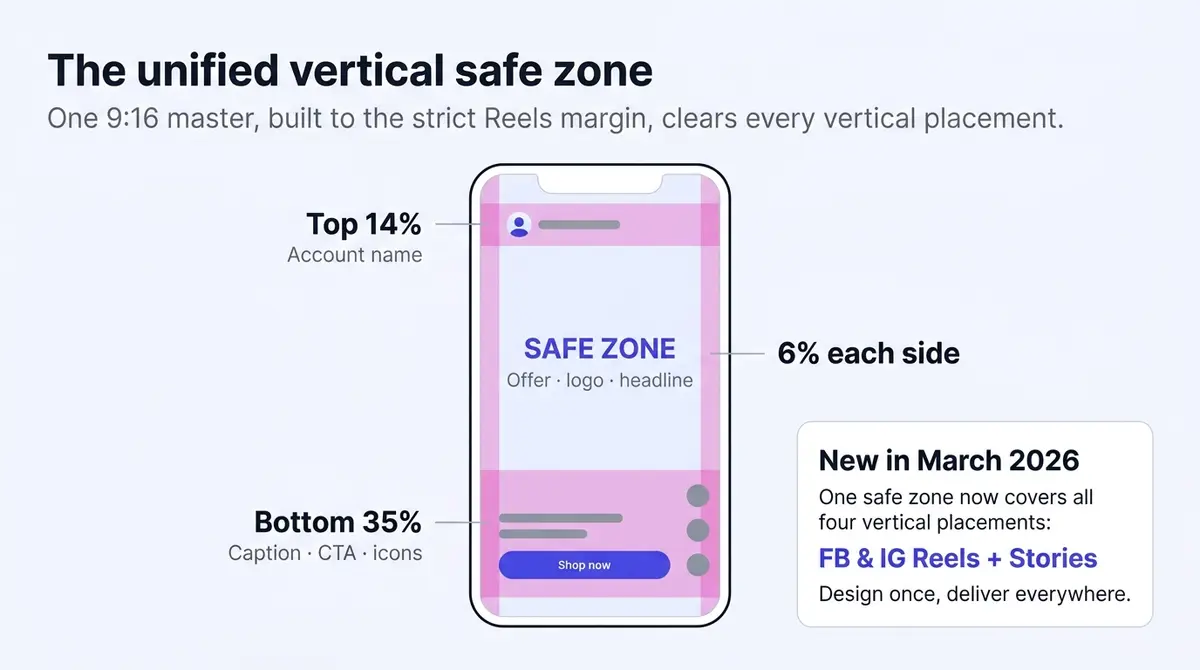
The upshot is the same "design once, deliver everywhere" thesis this page is built around, now applied to the trickiest surfaces. One 9:16 master composed to the strict Reels margin passes every vertical placement automatically, with no per-placement re-crop. The file to worry about is an older Stories template with content parked in its roomier legacy bottom margin: run that same creative on Reels and the lower 35% is now hidden, so anything important down there disappears. Re-center it once and it is safe everywhere.
Safe-zone margins in pixels
Percentages are easy to forget mid-design, so drop these guides into your template. The pixel figures assume Meta's 1080 x 1920 reference canvas; the right two columns scale them to the recommended 1440 x 2560 master. Our ad size checker draws the same bands over a live frame, and over your own file if you add one.
| Margin | Percentage | At 1080 x 1920 | At 1440 x 2560 |
|---|---|---|---|
| Top (all vertical) | 14% | 270 px | ~358 px |
| Bottom (Reels, the unified target) | 35% | 670 px | ~896 px |
| Bottom (legacy Stories only) | 20% | 380 px | ~512 px |
| Each side | 6% | ~65 px | ~86 px |
Figures derived from Meta's percentages on the stated canvases (Lucid Media, 2026; Meta spec, 2026). Design to the 35% Reels bottom and you never need the legacy Stories row again; it is shown only so an old template makes sense. The practical translation is to compose vertical creative like a movie poster, message in the middle half of the frame. Price, offer, logo, and any text overlay live in that band. Apply it to a typical full-screen offer, like Victoria Facelift's free anti-aging firming session at IOI Mall Puchong: the offer, the outlet name, and the booking prompt all need to sit mid-frame, because the bottom third where a designer instinctively parks them is exactly where the caption and CTA button stack. Then preview on an actual phone before launch, because the desktop preview hides exactly the overlays that cause the problem.
Accepted versus recommended: the distinction that explains weird crops
Two of Meta's numbers do different jobs, and confusing them is why ads run ugly without being rejected. The recommended resolution is the size that looks best (1440 px wide and up). The technical minimum is the smallest file Meta accepts before it refuses the upload (600 px wide on the Facebook feed, 500 px on the Instagram feed, per Meta spec, 2026). An asset between those two numbers uploads, runs, and looks soft, so "it was accepted" is not the same as "it is the right size."
Aspect ratio works the same way, and Meta builds in a small cushion. The feed accepts everything from 1.91:1 landscape to 4:5 vertical, but accepted is not recommended: a landscape image still serves, it just renders smaller and Meta gives the taller ratios more room. There is also a 3% aspect-ratio tolerance before Meta crops or pads a file (per Meta spec, 2026), which is why a near-1:1 export is not always cropped to an exact square, and why a file a hair off from 4:5 can still run untouched. Past that 3% window, the platform either trims the edges or letterboxes the gap. When an ad runs but looks cramped or off-center, the fix is usually moving from a merely accepted ratio to the recommended one for that placement, not a rejection to appeal.
Text limits before the cutoff
| Placement | Primary text | Headline | Description |
|---|---|---|---|
| Facebook feed | 50-150 recommended | 27 | n/a |
| Facebook Reels | 40 | 55 | n/a |
| Facebook Stories | 125 | 40 | n/a |
| Instagram feed and Explore | 125 | 40 | n/a |
| Instagram Stories | 125 | not listed | n/a |
| Instagram Reels | 44 | not listed | n/a |
| Carousel | 80 | 45 | 18 per card |
| Marketplace | 125 | 40 | 30 |
Character counts per Meta spec, 2026. These are the points where the visible text truncates, not the hard ceilings. On the Instagram feed and Explore the primary text can technically run up to 2,200 characters total (the same 2,200-character cap as an organic caption, where only the first 125 or so show before the "more" cutoff), so the extra room is rarely worth using (Letter Counter, 2026). Two habits cover most of the risk. Front-load: the offer goes in the first sentence of the primary text, because everything past the cutoff hides behind "See more" and most viewers never tap it. And write Reels copy separately: 40 to 44 characters is a sentence fragment, not a paragraph, so on Reels the creative itself has to carry the message while the text closes the deal.
The 20% text rule, and why people still ask about it
For years Facebook rejected any ad image where text covered more than 20% of the frame, and a grid-overlay tool policed it. That hard rule is gone. Meta removed it in September 2020 and downgraded it to a best-practice recommendation rather than an enforced limit (Search Engine Journal, 2020). So a text-heavy graphic will not get killed for the text alone today.
The softer guidance survives: Meta still notes that images with less text tend to perform better. That is about legibility, not policy. A feed thumbnail on a phone is small, and a paragraph baked into it becomes an unreadable smear. Keep type large and sparse not because a rule demands it, but because a clear three-word hook beats a dense block at thumbnail size.
When your ad looks wrong: a troubleshooting checklist
Most "why does this look bad" problems trace to a few causes:
| Symptom | Likely cause | Fix |
|---|---|---|
| Blurry or pixelated | Source upscaled to hit the recommended size | Export at or above spec from the original; never enlarge a small file |
| Black bars top or sides | Aspect ratio does not match the placement | Render a version in the placement's ratio (9:16, 4:5, or 1:1) |
| Headline or logo cut off | Auto-crop trimmed a single master, or content sits in the safe zone | Use asset customization per placement; keep key elements in the middle band |
| Upload fails or stalls | Edit lists in the MP4 or MOV container, or file over 4 GB | Export a flattened final render under 4 GB, not a project or proxy file |
| Text hidden behind "See more" | Primary text past the truncation point | Move the offer into the first line, before the cutoff |
The recurring lesson is that auto-crop is a convenience, not a finish. Letting Meta squeeze one asset into every frame causes most cut-off subjects and black bars. Assigning a purpose-built master to each placement, in the step below, removes the whole category of problem.
Design for sound off, then add captions
One failure mode never shows up as a crop or a rejection: a spec-perfect video that lands flat because it was built for sound the viewer never turned on. Feed and Reels autoplay muted, so a video whose message lives in the voiceover reaches almost no one. Design the cut to make sense on mute first: show the product, put the offer on screen as text, and let sound be a bonus rather than the carrier. Then caption the dialogue. In Ads Manager you can upload your own SRT file or have Meta generate captions automatically, then review and edit each line before publishing (per Meta spec, 2026). Auto-captions mishear product and brand names, so read them before launch.
Make the sizes a system, not a chore
Specs are the floor. Meeting them stops rejections and bad crops; it does not make anyone stop scrolling. So spend as little ongoing effort on sizing as possible and route the savings into creative testing. A workflow that holds up:
- Design the 9:16 master at 1440 x 2560 with safe-zone guides locked at 14% top and 35% bottom, the unified vertical margin that now covers Reels and Stories on both platforms.
- Derive the 4:5 and 1:1 versions from it, recomposing rather than cropping blind, so the product and headline survive each frame.
- Export at spec: JPG or PNG under 30 MB, MP4 with H.264 and AAC audio under 4 GB, captions added or burned in.
- In Ads Manager, at the ad level, turn on customize media by placement, then replace the default crop with your purpose-built master for each surface (one for feed, one for the vertical placements) instead of letting auto-crop guess. Advantage+ placements still serve every surface, but each one shows the asset you composed for it.
- Re-check this page (or Meta's ads guide) quarterly, because Meta has bumped its recommended resolutions in recent years and old templates rot silently.
The teams that ship weekly creative tests do not resize by hand each round; they build the three masters once per concept and let their editor export every placement at spec. A tool that keeps brand kit, graphic editing, and video editing in one place, AdPlay.ai among them, removes that churn entirely. With the sizes systematized, the next step is the campaign itself: how to run a Facebook ad walks the full Ads Manager setup from objective to launch.
By the numbers
Frequently asked questions
What size should a Facebook feed ad be in 2026?
Meta recommends 1440 x 1440 pixels for a square 1:1 image or 1440 x 1800 for the vertical 4:5, with a minimum width of 600 pixels (per Meta spec, 2026). Both JPG and PNG work, up to 30 MB per file. The 4:5 vertical is the safer default because it takes more screen on mobile, where most feed impressions happen. Feed video follows the same two ratios, uploaded as MP4 or MOV up to 4 GB.
What is the correct size for Instagram Reels ads?
Full-screen 9:16 vertical at 1440 x 2560 pixels, uploaded as MP4 or MOV up to 4 GB with H.264 compression and AAC audio (per Meta spec, 2026). The paid Instagram Reels ad spec accepts anything from 0 seconds to 15 minutes, although the format rewards much shorter cuts. Keep text and logos out of the top 14%, the bottom 35%, and 6% on each side, because the account name, caption, audio tag, and CTA button overlay those zones. Since the March 2026 unified-safe-zone update those same margins now cover every vertical placement, so one Reels-spec master is safe across Stories too.
Is the Facebook 20% text rule still in effect, and will too much text get my ad rejected?
No. Meta removed the hard 20% limit on text in ad images in September 2020 and downgraded it to a best-practice recommendation, so heavy text no longer rejects an ad on its own (Search Engine Journal, 2020). Meta still notes that images with less text tend to perform better, which is a recommendation, not a rule. So you can run a busy graphic, but keep type large and sparse because most feed impressions are tiny mobile thumbnails where dense text is unreadable.
Did Meta change the Reels and Stories safe zones in 2026, and do I still design them separately?
Yes, this changed in March 2026, and the practical answer is now no. Meta consolidated Facebook Stories, Facebook Reels, Instagram Stories, and Instagram Reels into a single 9:16 safe zone built to the tightest placement, Reels, at 14% top, 35% bottom, and 6% on each side (Lucid Media, 2026; Meta spec, 2026). Designing one 9:16 master to that strict Reels margin now clears every vertical placement automatically, so the old habit of giving Stories a roomier bottom margin is retired. If anything, an older Stories template with content parked in the bottom 35% is the file to fix, because that band is now hidden on Reels.
What aspect ratio should a carousel ad use, and why do my carousel cards get cropped?
Use one aspect ratio for every card, and make it 1:1 at 1080 x 1080 pixels (Meta spec, 2026). Every card in a carousel has to share a single ratio (Meta spec, 2026), and in practice mixing them is the usual reason a carousel looks wrong: a 4:5 card dropped in beside square cards renders cropped to 1:1 on some surfaces, cutting off the product or text. The 4:5 vertical that wins in the single-image feed is the trap here, so 1:1 is the safe carousel default even though 4:5 wins elsewhere. A carousel runs 2 to 10 cards, image cards as JPG or PNG up to 30 MB and video cards as MP4 or MOV up to 4 GB.
What size should a Facebook In-Stream (mid-roll) video ad be?
Meta accepts 16:9 or 1:1 for In-Stream, recommends a minimum resolution of 1080 x 1080 pixels, and caps the file at 4 GB as MP4, MOV, or GIF (per Meta spec, 2026). Length runs 5 to 15 seconds on desktop and 5 seconds to 10 minutes on mobile, though In-Stream often plays with sound on, so a clear hook in the first few seconds matters more than burned-in captions here. This placement only serves when your campaign includes it, so check your placement settings if you do not see it.
Will my three masters (1:1, 4:5, 9:16) also cover Audience Network and Messenger placements?
Yes. When you leave Advantage+ placements on, Meta also serves on the Audience Network (third-party apps and sites) and inside Messenger, and both reuse the same three frames you already built, so there is nothing extra to design (per Meta spec, 2026). The quirks are worth knowing: Audience Network native and interstitial units run full-screen 9:16 and the banner unit is a small strip, while the Messenger inbox shows a compact thumbnail. As long as your safe zones hold and your headline survives a small crop, the masters you composed for feed and Reels already cover these surfaces.
Can I run the same creative in feed and Reels?
You can let Meta auto-crop one asset across placements, but the results are rough: a 4:5 feed image stretched to 9:16 loses composition, and a 9:16 asset cropped square can cut off the product or the headline. The cleaner workflow is two or three masters (1:1, 4:5, 9:16) from one design, each composed for its frame and safe zone, then assigned per placement in Ads Manager with asset customization. That also lets you change the message per surface, not just the crop. Since the March 2026 unified safe zone, your one 9:16 master already passes Reels and Stories together, so you are really maintaining three canvases, not five.
Sources
- 1.Meta Ads Guide, Facebook Feed Image Ad Specs (2026)
- 2.Meta Ads Guide, Instagram Reels Video Ad Specs (2026)
- 3.Meta Ads Guide, Facebook Stories Video Ad Specs (2026)
- 4.Meta Ads Guide, Instagram Feed Image Ad Specs (2026)
- 5.Meta Ads Guide, Instagram Feed Video Ad Specs (2026)
- 6.Meta Ads Guide, Instagram Stories Video Ad Specs (2026)
- 7.Meta Ads Guide, Instagram Stories Image Ad Specs (2026)
- 8.Meta Ads Guide, Instagram Explore Image Ad Specs (2026)
- 9.Meta Ads Guide, Facebook In-Stream Video Ad Specs (2026)
- 10.Shopify, Facebook Ad Sizes and Specs Guide (2026)
- 11.Buffer, Facebook Ad Specs and Image Sizes (2025)
- 12.Buffer, Square Video vs. Landscape Video Experiment (2025)
- 13.Search Engine Journal, Facebook Removes the 20% Text Limit on Ad Images (2020)
- 14.Letter Counter, Instagram Character Limit Guide (2026)
- 15.Meta Ads Guide, Carousel Ad Specs (2026)
- 16.Lucid Media, Instagram and Facebook Ad Safe Zones 2026 (2026)
- 17.DataReportal, Digital 2026 Mid-Year Global Update Report (2026)
Keep exploring
Turn ad research into winning ads
Research the ads that work, generate the creative on-brand, and launch to Meta, all in one tool.
7-day free trial · No credit card required