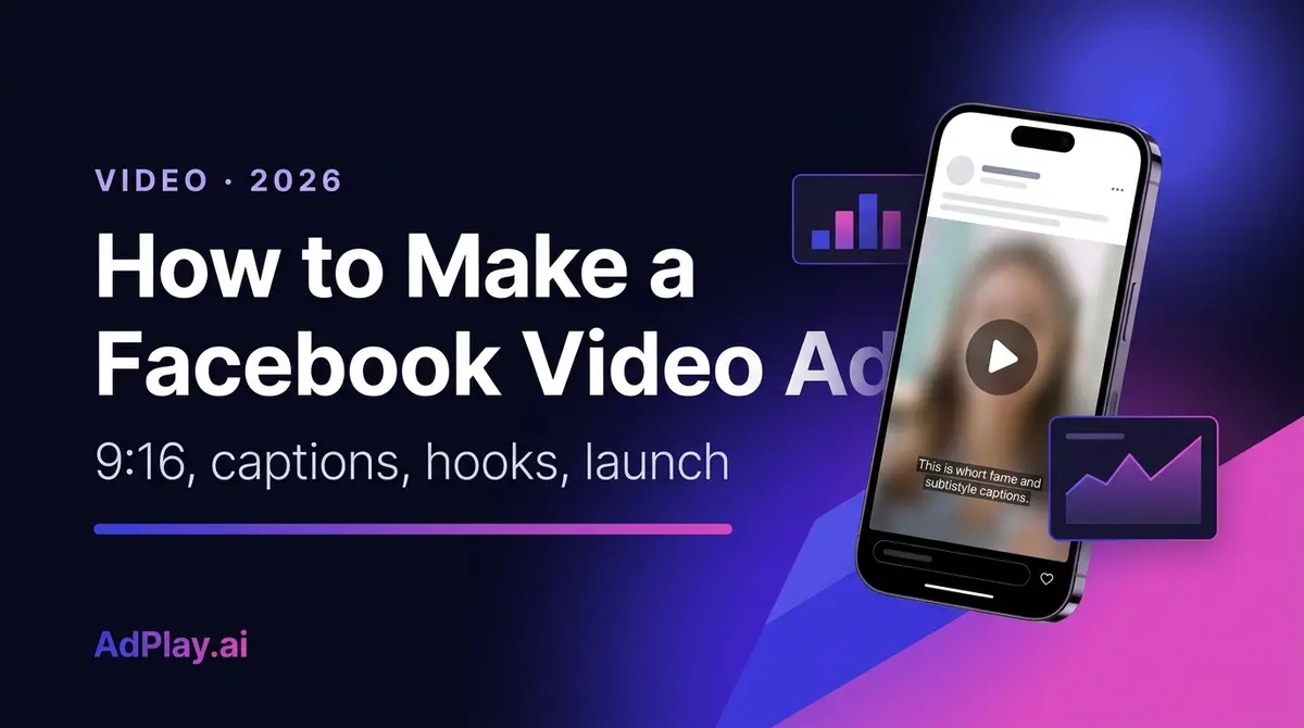
How to Make a Facebook Video Ad in 2026
Make a Facebook video ad that stops the scroll: named hooks, hook rate, the 9:16 and 4:5 specs, captions for muted feeds, scripts, and a test loop.
Updated June 2026 · Likit Sae Lee, CTO
To make a Facebook video ad, shoot vertical (9:16 for Reels and Stories, 4:5 for feed), put your strongest moment in the first two seconds, and burn in captions because most of the feed scrolls with the sound off. Keep it to 15-30 seconds, export as an MP4 with H.264 compression, and upload it to a campaign in Meta Ads Manager. Grade every video by its hook rate, the share of impressions that watch three seconds, then test new opening hooks against the same body each week. A phone, a clear hook, and a tight test loop beat a studio production that takes a month.
The video ad you keep putting off does not need a videographer, a studio, or a week of editing. It needs a phone held vertically, one clear idea, and a hook that lands before a thumb flicks past. Video now carries Meta's feed: Reels is the fastest-growing surface the company sells, and the auction rewards advertisers who keep feeding it fresh motion. The whole job breaks down into five decisions: the hook, the framing, the captions, the shot structure, and the export. Get those right once and every video after this one gets faster.
Why video earns the feed
Facebook's feed is an auction for attention before it is an auction for money, and motion wins that first auction. A static image gets one frame to make its case; a video gets to change, and change is what a scrolling eye notices. Meta has rebuilt its apps around this: Reels, the short vertical video surface, passed a $50 billion annual ad revenue run rate in late 2025, the figure Mark Zuckerberg gave on the company's third-quarter earnings call.
The competition for the click is just as real. WordStream's 2025 benchmarks put the average click-through rate for Facebook traffic campaigns at 1.71%, meaning roughly 98 of every 100 people who see an ad keep scrolling. Which side of that line you land on is rarely decided by the audience setting; it is whether the first moment of the video gives anyone a reason to stop. The hook, the framing, and the captions all exist to win that moment and then hold it.
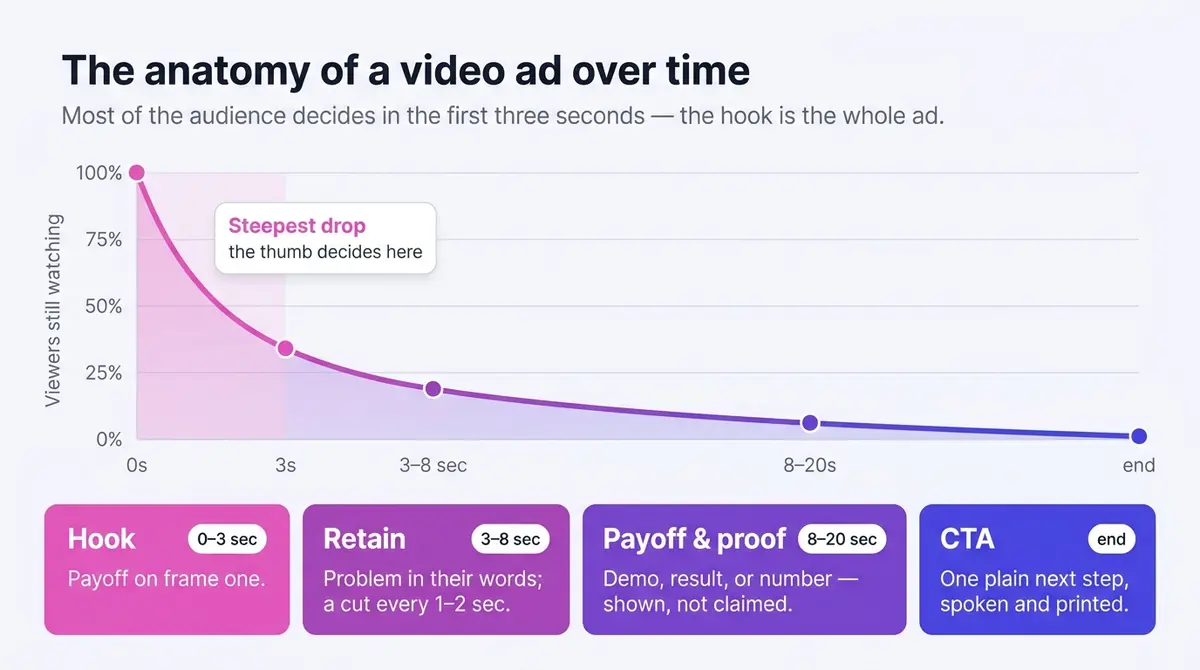
The attention math is brutal, which is why the first frame is the whole ad
The "open strong" advice every guide repeats is not a style preference. It is a response to how little time the feed gives you. Meta's own attention research found that people spend, on average, 1.7 seconds with a piece of content on mobile, against 2.5 seconds on desktop, and that it takes only 0.25 seconds of exposure for someone to recall mobile-feed content at a statistically significant rate (Meta for Business, 2016). Read those two numbers together and the design brief writes itself: the brain registers your ad in a quarter of a second, and the thumb decides its fate inside two. Whatever has to land has to land in frame one, at a glance.
That same brevity is why a brief view is still worth winning. A Facebook-Nielsen analysis of 173 brand-effect studies found measurable lift even among viewers who saw an ad for three seconds or fewer: ad recall rose 47%, brand awareness 32%, and purchase intent 44% (reported by MarTech, 2015). The opening does real work even for the majority who never watch through, so the cost of a weak first frame is not just a lost view, it is a lost impression you already paid for.
The hook: a menu you can write to in five minutes
Treat the opening two seconds as the whole ad, because for most viewers it is. The non-negotiables: open on the payoff, not the setup, put a person or hands in motion in the first frame, and cut the throat-clearing entirely (no fade from black, no intro card, no greeting). Frame one is already the ad. A useful test before you upload: scrub to the two-second mark and pause; if someone who saw only those frames could not tell what the ad is about, recut the open.
Beyond those rules, "make it interesting" is not a brief. Keep a short menu of opening patterns and pick one deliberately for each video, because a named pattern is something you can write to in five minutes. These all earn their place in the feed:
- Question hook. Ask the exact thing the buyer worries about ("Why does your foundation crack by lunch?"). They answer in their head and keep watching for yours.
- Result-first hook. Open on the finished state, then rewind: glossy hair, then "three weeks ago this was the problem."
- Before-and-after hook. State one, hard cut, state two, in the first two seconds. The contrast does the selling.
- Problem-callout hook. Put the pain in plain text on frame one ("Bloated every afternoon?"). People who have that problem stop instantly.
- Stat or claim hook. Lead with one surprising, true, defensible number on screen, because Meta polices exaggerated claims.
- Demonstration hook. Start mid-action with the product doing its one satisfying thing, no preamble.
- Curiosity-gap hook. Tease the outcome, not the how ("I almost returned this until I tried one thing"), then deliver it. Never bait and switch.
- Social-proof hook. Open on a real person mid-sentence, or a stack of reviews, so the recommendation lands before the pitch.
- "People keep asking me" hook. A creator answering an implied question reads as a tip, not an ad, which is why it travels.
- Pattern-interrupt hook. An unexpected visual or sound in frame one, then a fast pivot to the product.
The menu is easier to trust once you see it working. Two representative angles make the point: Skinlycious opens a testimonial video on a mum describing her daughter's forehead pimples clearing (the social-proof hook, carried by a real voice instead of a review screenshot), and Callaa Closet starts mid-demonstration, a magnetic shawl slipping on without pins before a single word of pitch. Different products, same discipline: the payoff is the first thing on screen.
Write two or three of these for any product, shoot the openings back to back, and you have your test set for the week.
Measure the hook, then measure the hold
You cannot improve what you are not grading, and the two numbers that grade a video ad are not in Ads Manager by default. Build them once as custom metrics and they pay you back on every test after.
Hook rate is three-second video plays divided by impressions: the share of people who stopped scrolling long enough for your opening to register. A three-second play is Meta's own bar for counting a video as viewed (or the full length if the clip runs under three seconds), so this metric reads the first frames directly. Build it from the three-second video plays column. Skip the hunt for a universal "good" number: it moves with your offer, audience, and price point, so the benchmark that actually guides you is your own running average across past videos. When a new video's hook rate sits well below that average, the first frames are almost always the problem, not the audience, so recut the open before you change a single targeting setting.
Hold rate is the second gauge, and it is worth knowing it has two common formulations, because guides quote both and mean different things:
- Hold rate proper: ThruPlays divided by three-second plays. Of the people the hook caught, how many stayed for the message? Read each video's figure against your own account history rather than a published target.
- ThruPlay rate: ThruPlays divided by impressions, times 100. This grades the open and the body together, against everyone who saw the ad, not just the ones who already stopped. A ThruPlay, by Meta's own definition, is a complete view for clips under 15 seconds, or at least 15 seconds watched on a longer one.
Expected ThruPlay rate tracks length, because the metric mechanically rewards short clips: a sub-15-second video can complete the moment it plays through, while a longer cut only earns a ThruPlay once 15 full seconds are watched, so its rate sits far lower on the same audience. That is why you compare like with like, never a 30-second ad's ThruPlay rate against a 12-second ad's, and why your own past videos at the same length are the only honest yardstick.
A worked example makes the numbers concrete. Say an ad set serves 18,000 impressions and reports 4,200 three-second plays and 2,100 ThruPlays. Hook rate is 4,200 / 18,000 = 23%. Hold rate proper is 2,100 / 4,200 = 50%. ThruPlay rate, against all impressions, is 2,100 / 18,000 = 12%. Run the same arithmetic on every variant, line the rates up against the same video's earlier cuts, and the comparisons read themselves.
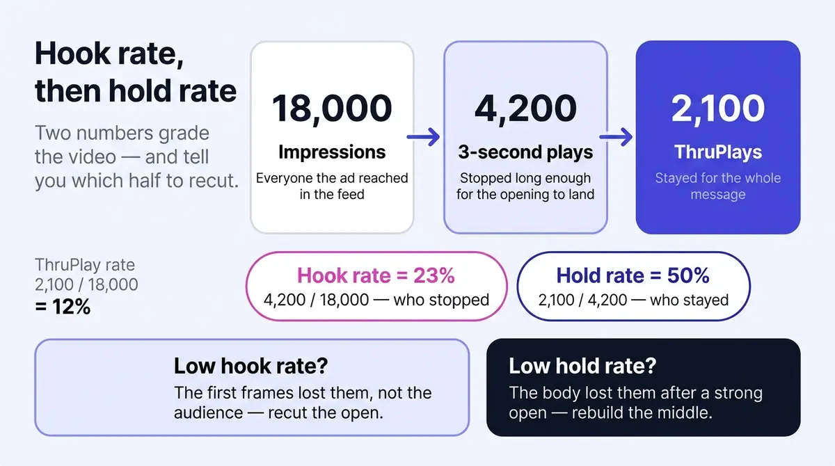
Reading the pair diagnoses the video. A high hook rate with a low hold rate means the opening overpromised: keep the hook, rebuild the middle. A low hook rate with a high hold rate means the open is filtering out everyone else: keep the body, write new hooks. Fix whichever number is breaking, and you stop guessing at which half of the video to recut.
Framing, placement, and captions
Shoot vertical and stay vertical. Reels and Stories run full-screen at 9:16, and for the mobile feed Meta's ads guide recommends 4:5, the tallest crop the feed allows. A 16:9 landscape video shrinks to a letterboxed strip on a phone and surrenders most of the screen it paid for. Film at 9:16 with the key action centered and you can crop a 4:5 feed version from the same footage.
The vaguest advice in most guides is "keep text away from the edges," so here are the numbers. On a 1080x1920 vertical canvas, Meta's interface reserves roughly the top 14% (about 270 pixels) for the profile icon, name, and "Sponsored" label. The bottom is hungrier: budget around 20% for Stories and as much as 35% for Reels, where the like, comment, share, and audio controls plus the caption stack pile up. Keep every word of your headline, price, logo, and call to action inside that middle band. Ads Manager's creative preview has a safe-zone overlay; toggle it on for every vertical asset before you publish.
One vertical master covers most placements, but a few want a different shape, and Ads Manager will run a clipped crop if you let it. This is the map from placement to format, drawn from Meta's ads guide and Shopify's current spec reference:
| Placement | Aspect ratio | Recommended resolution | Video length |
|---|---|---|---|
| Facebook & Instagram feed | 4:5 (or 1:1) | 1080x1350 (1080x1080) | 1 sec to 241 min |
| Stories | 9:16 | 1080x1920 | 1 sec to 2 min |
| Reels | 9:16 | 1080x1920 | up to 90 sec |
| In-Stream | 16:9 or 1:1 | 1080x1080 | 5-15 sec |
| Marketplace | 1:1 | 1080x1080 | 1 sec to 241 min |
The practical takeaway: film 9:16, crop a centered 4:5 for feed, and export a centered 1:1 if you run In-Stream or Marketplace. Whatever you upload, open the per-placement previews and re-crop any version where a face, caption, or price gets clipped. Treat recommended resolutions as minimums; more pixels survive compression better.
Then caption everything, because the feed defaults to muted autoplay, and publishers were telling Digiday as far back as 2016 that up to 85% of their Facebook video views happened with the sound off. The payoff for designing around it is measurable: Meta's own research, reported by 3Play Media, found captioned video ads earn about 12% more average view time than the same ads without captions. So design for silence: text for every spoken line, overlays for the key claims, and visuals that carry the story even if the audio never plays. Prefer burned-in captions over auto-generated ones. Burned-in text lives in the video file, so it always shows, you control its position (above the safe zone) and styling, and it survives every placement and crop. Meta can also auto-generate captions or accept an uploaded caption file in Ads Manager, a fine backstop, but auto captions misread product names and slang, and a viewer can switch them off. Make the captions yours and proof them once.
The caption craft is where most muted ads quietly fail, so a few specifics earn their place. Set captions in a heavy weight, large enough to read at arm's length on a phone (a rough rule: a single line should span most of the safe-zone width, not float small and centered), and put a solid or semi-opaque block behind the text so it stays legible over a busy background instead of dissolving into it. Keep each card to one or two short lines and sync it to the speech, swapping the card as the sentence changes rather than dumping a paragraph on screen, because a wall of text reads as work and the thumb keeps moving. Most important, the hook belongs on screen as text in frame one, not only in the voiceover: muted autoplay means the offer has to be legible before a single word is heard, so the line that would have opened the script ("Foundation cracking by lunch?") is also the first thing printed in the frame. Sound still deserves care, a real voiceover or a music bed, because the viewers who tap in are often the warmest ones, but the ad has to work mute first.
The cover frame is its own lever
The thumbnail, or cover frame, is a controllable asset most advertisers leave to chance, and it matters in two places: it is what shows before autoplay kicks in on some surfaces, and it is the still that represents the video in the Reels grid and in any saved or shared view. Choose or design it deliberately. A clear human face or the product mid-use reads instantly at thumbnail size; a logo card or a dark, busy frame does not. Keep on-frame text minimal: Meta stopped penalizing images with more than 20% text overlay back in September 2020, so a text-heavy cover no longer blocks delivery, but heavy text still tends to underperform and is unreadable shrunk to grid size. In Ads Manager you can pick the cover from a video frame or upload a custom one; treat it as the ad's poster, not an afterthought.
Reels vs Feed vs Stories: three surfaces, three jobs
The spec table gives the dimensions; it does not tell you that the same clip behaves like three different ads across these surfaces. The frame, the viewer's intent, and the default sound state all change, and a video that wins in feed can die in Reels for reasons that have nothing to do with the creative being weak. Knowing how the surfaces differ lets you choose where a video belongs instead of blasting one master everywhere and hoping.
Feed is the workhorse: in-feed and muted by default. A feed video sits inside a scrolling column of posts at 4:5, sharing the screen with the next post peeking up from the bottom. The viewer is browsing, half-attentive, sound off. This is the surface the silent-feed rules above were written for: the offer has to be legible muted, in the top of the frame, before the thumb moves on. Feed reaches your followers and the broad audiences Meta picks, and it carries the most volume for most accounts, which is why a 4:5 cut is the version you should always have.
Reels is the discovery surface: full-screen and sound-on-leaning. A Reel plays full-screen 9:16 with no competing posts, served largely to people who do not follow you, in a feed built for finding new content. Two things follow. Sound matters more here than anywhere else, because Reels viewers arrive expecting audio, so a clear voiceover, a music bed that matches the energy, or native audio can lift a Reel that would have played fine but flat in muted feed (it must still survive muted, but Reels is where the sound-on layer earns its keep). And because it is a discovery surface, Reels is where reach and new-audience exposure live, so it rewards a hook that works for a stranger. Reels ads run up to 90 seconds, with 15 to 30 the sweet spot.
Stories is ephemeral and swipe-fast, at the top of the app. Stories play full-screen 9:16 above the feed, one after another, and a viewer taps through them in seconds with a thumb already hovering on the right edge. That impatience is the design constraint: a Story ad has even less grace than feed, so the payoff has to be immediate and the call to action has to be obvious and reachable in the bottom third. Stories run up to two minutes technically, but the surface punishes length, so keep it tight. It skews toward people who already know the brand, which makes it a strong retargeting and reminder surface more than a cold-discovery one.
| Surface | Frame | Default sound | Reach skew | What wins here |
|---|---|---|---|---|
| Feed | 4:5 in-feed, shares the screen | Muted | Followers and broad delivery | Legible muted, offer in the top of frame, the workhorse cut |
| Reels | 9:16 full-screen | Leans sound-on | Discovery, new audiences | A hook for strangers, a voiceover or music bed, native energy |
| Stories | 9:16 full-screen, top of app | Sound varies, often muted | Followers, warm audiences | Immediate payoff, reachable CTA, kept short |
The practical move is not to pick one. Film 9:16 sound-on, cut a 4:5 muted-legible version for feed, and let one master feed all three placements while you read which surface delivers your cheapest result, then lean budget there. A video built to work muted and full-screen, with a hook that lands for a stranger, qualifies broadly across all three.
Shot structures and scripts that need no studio
You do not need a production crew. You need one of these structures, a phone, and window light.
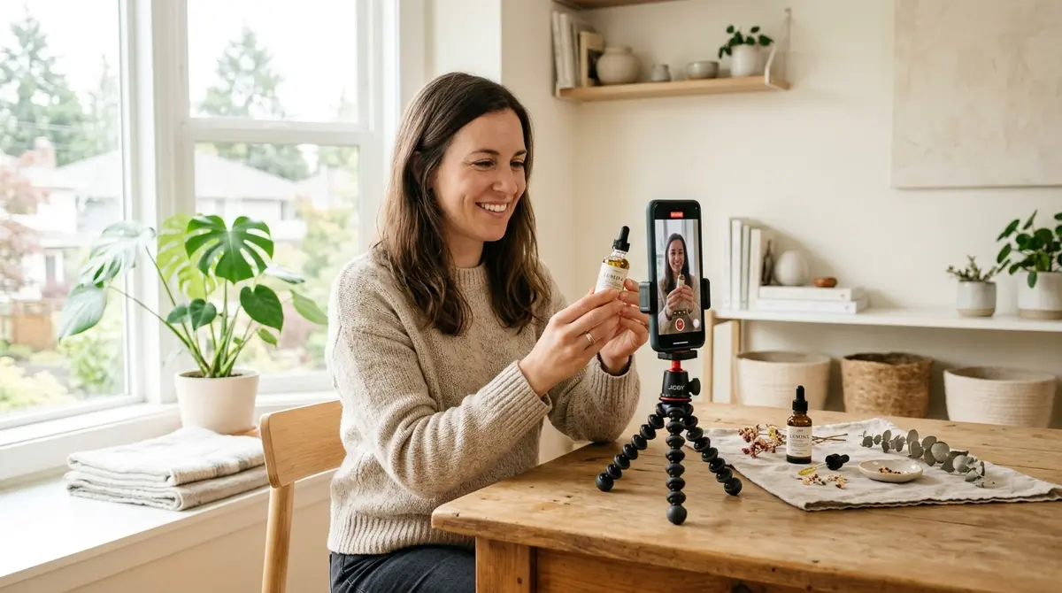
The talking head, often as UGC. One person, framed chest-up, speaking to camera: hook line ("I stopped buying foundation because of this"), one point in the middle, then what to do next. Prop the phone at eye level, face the window, record three takes. When that person is a real customer or a hired creator rather than a polished spokesperson, this becomes user-generated content (UGC), and it converts because it reads as a recommendation, not an ad. Film it yourself if you are comfortable on camera; hire a creator when you need a face that fits the audience or more output than you can shoot alone. Either way, keep it handheld and unpolished, because a glossy studio version usually performs worse here.
The demo. The product doing the thing it exists for, hands in frame, shot close. Open on the most satisfying moment of use, then show the two or three steps around it. Cut every shot to a second or two; a demo earns attention with rhythm, not narration. XCORE Fitness Sabah's video for a folding home treadmill is the structure in miniature: the fold is the hook, the demo does the persuading, and the price (under RM2500) closes.
The before-and-after sequence. State one, a hard cut or a wipe, state two. Cluttered desk to clear desk, dull hair to glossy hair, blank wall to gallery wall. The structure makes the argument by itself, which is why it suits any product with a visible result. Keep the transformation typical of what a real buyer gets, and tread carefully with health and beauty claims, where Meta's ad policies are strictest about implied results.
The founder or origin story. You, or whoever built the product, on why it exists. This is the one format that earns a longer runtime, because a story holds attention a 15-second cut cannot; use it to warm a colder audience, then retarget with the demo and before-and-after cuts.
A talking-head or UGC video lives or dies on the script, and the structure is always four beats you can fill in for any product in minutes. Hook: name the audience and the pain, or open on the result ("If your foundation cracks by lunch, watch this"). Problem: one or two lines that make the viewer feel understood, no more, because dwelling on the pain bleeds attention. Proof: the single most convincing thing you have (a demo of the fix, a result, a review, a credential), shown rather than claimed. Call to action: one clear next step, spoken and printed in the captions. Keep one idea per video, because a feed video that argues one point well beats one that argues five weakly. Write the hook line first, read it aloud, and time it; if it runs past 30 seconds, cut the problem, not the proof. Film any of these in an afternoon and you walk away with a master clip plus enough alternate takes to feed the variations that come later.
Cut for the hold rate, not just the hook
The script wins the stop; the editing wins the stay. Hold rate, the number that measures whether people finish the message, is moved almost entirely by the rhythm of the cut, and a flat, single-take video bleeds viewers no matter how strong the first frame was. A few editing habits earn that second number back. Cut fast: a new shot, angle, or framing every one to two seconds keeps the eye refreshing, where a talking head holding the same frame for fifteen seconds reads as a lull and invites the swipe. Plant a pattern interrupt around the five-to-seven-second mark, where drop-off tends to spike on short ads: a hard zoom, a jump cut, a sudden change of scene or sound, a fresh on-screen line, anything that resets attention right when it would otherwise drift. Use b-roll and text overlays to re-hook mid-video so the middle never goes visually quiet. Zoom punches and jump cuts that trim every dead beat are the cheapest way to lift hold rate, and they need no equipment beyond the edit. The goal is simple: never let two seconds pass without a reason to watch the next two.
Length, export, and the upload
On length, shorter wins more often than it loses. The strong default is 15-30 seconds: room for a hook, a proof, and a call to action, and short enough to hold a feed-trained attention span. Meta technically accepts up to 241 minutes in feed, but nobody has watched minute 200 of an ad, so go longer only when the content earns it and front-load it so the first half still works alone. For export, MP4 or MOV with H.264 and stereo AAC audio under the 4GB ceiling sails through review; a 30-second ad never threatens that limit.
The upload itself takes minutes. In Meta Ads Manager, build or open a campaign, choose the single image or video format at the ad level, upload the file, and review the per-placement previews so the crops look right in feed, Reels, and Stories. If the layers above the ad (objective, budget, audience) are the unfamiliar part, the walkthrough in how to run a Facebook ad covers that setup step by step.
Do not coast on the written layer, because the text under the video often closes the click the video opened. The primary text above the video runs about 125 characters before "more" truncates it, so front-load the offer there too, and let the short headline state the benefit, not the brand name. Then match the call-to-action button to the destination (Shop Now or Buy Now for a product page, Learn More for a longer one, Sign Up or Get Offer for a lead or coupon), because the button should describe what happens after the tap.
Before you publish, a two-minute QA pass saves a day of rejected-ad limbo. Confirm the hook works muted (pause at two seconds; the point is clear with no sound). Confirm the captions are accurate and inside the safe zone, with no words clipped by the interface and no misspelled product name. Confirm the claims are defensible, with no exaggerated health, beauty, weight-loss, or income promises and before-and-afters that show typical rather than miraculous results, since those are the most common rejection reasons. Confirm the thumbnail is not text-heavy and the audio is clean and licensed (use Meta's sound collection, never a copyright-claimed track). And confirm the specs are right: MP4 or MOV, H.264, under 4GB, correct aspect ratio per placement.
Win on velocity, not on one video
Testing is not "make a lot of ads." It is changing one thing, reading the number it moves, and keeping the winner. For video, that one thing is almost always the hook: the cheapest variable, and the one that moves hook rate most. Here is a four-week loop you can run:
| Week | What you do | What you read |
|---|---|---|
| 1 | Ship one body with 3-5 different opening hooks, everything else identical | Let impressions accumulate; do not touch it |
| 2 | Compare hook rate across the variants; keep the top one or two, cut the rest | Hook rate (3-sec plays / impressions) |
| 3 | Add 2-3 new hooks against the surviving body | Hook rate of new vs held-over winners |
| 4 | Promote the consistent winner to a higher budget; check it still holds | Hold rate and cost per result |
The discipline is what makes it work: keep the script, length, captions, and call to action constant so a change in hook rate is the hook's doing, not noise. Give each variant a few days to read a stable number before you judge it. After a month you have measured which opening works, not guessed it.
The first video is not the goal, because video fatigues within weeks. The advantage goes to whoever can keep that loop fed, and that is a production-time problem: the master clip is cheap to vary, but cutting and re-captioning each variant by hand eats the week. AI generation grounded in your brand, plus a real editor with a timeline, captions, and voiceover, the way AdPlay.ai packages them alongside a direct launch to Meta, collapses that work into an afternoon.
This week's action list: pick one product, film a talking head and a demo against the structures above, caption both, export at 9:16 and 4:5, and put a modest budget behind them (a few dollars a day is enough to start reading hook rates). By Monday the numbers will tell you which hook deserves the next variation.
By the numbers
Frequently asked questions
How long should a Facebook video ad be, and what should I export?
Default to 15-30 seconds. That is enough room for a hook, one proof point, and a call to action, and short enough to survive a feed-trained attention span. Meta technically accepts 1 second to 241 minutes in feed and caps Reels at 90 seconds, but watch time falls off fast, so a longer video only earns its length when the content genuinely holds, the way a founder story or detailed demo sometimes does. For export, use MP4 or MOV with H.264 video and AAC stereo audio at 128kbps or higher, square pixels and a constant frame rate, at least 1080p (1080x1920 for 9:16, 1080x1350 for 4:5), under the 4GB ceiling. Whatever the length, structure it so the first 5 seconds work as a complete ad on their own.
What is a good hook rate and hold rate, and how do I calculate them?
Hook rate is three-second video plays divided by impressions, times 100: the share who stopped scrolling long enough to register your opening. Hold rate is ThruPlays divided by three-second plays: how many of those stayers finished the message. Neither is in Ads Manager by default, so build them as custom metrics. Worked example: 4,200 three-second plays on 18,000 impressions is a 23% hook rate; 2,100 ThruPlays on those 4,200 plays is a 50% hold rate. The most useful benchmark is your own account: log every video's two rates, and read each new one against your running average rather than a universal target, because what counts as good swings with your offer, audience, and price point. The diagnosis is what matters. A low hook rate means the first frames, not the audience, so recut the open before you touch targeting; a low hold rate means the body, so rebuild the middle.
How many hook variations should I test at once, and what stays the same?
Run three to five hooks against one identical body. Keep the script, voiceover, captions, length, and call to action constant so the only variable is the first two to three seconds, which is what lets you attribute a lift to the hook rather than to chance. Give each variant enough budget and impressions to read a stable hook rate, usually a few days, then keep the winner, kill the clear losers, and feed in new openings. The body you spent the most time on rarely changes; the hook in front of it does.
What is the difference between Reels, Feed, and Stories, and where should I run my video ad?
They are three surfaces with different jobs, so one video behaves like three ads across them. Feed is the muted, in-feed workhorse at 4:5 that carries the most volume, so the offer must be legible with the sound off. Reels is the full-screen 9:16 discovery surface that reaches new audiences and leans sound-on, so it rewards a hook that lands for a stranger plus a clear voiceover or music bed. Stories is the ephemeral, swipe-fast 9:16 surface at the top of the app that skews to people who already know you, so it suits warm retargeting and an immediate payoff. The move is not to pick one: film a single 9:16 sound-on master, cut a 4:5 muted-legible version for feed, run all three, then lean budget toward whichever delivers your cheapest result. Open the per-placement previews and re-crop any version where a caption, logo, or face gets clipped.
Burned-in captions or Facebook's auto-generated ones: which should I use?
Use burned-in captions as your baseline. Burned-in text is part of the video file, so it always shows, you control its position and styling, and it survives every placement. Meta can also auto-generate captions or let you upload a caption file in Ads Manager, which is a useful backstop, but auto captions can misspell product names and slang, and a viewer can switch them off. Captioned ads earn meaningfully more watch time, so make the captions yours and proof them before upload.
Do I need a UGC creator, or can I film it myself?
Either works, and the choice is about voice, not budget. The user-generated content (UGC) look, a real person talking to a phone in a kitchen or bathroom, converts because it reads as a recommendation rather than an ad, and you can film that yourself if you are comfortable on camera. Hire a creator when you need a face that fits the audience, a demographic you cannot represent, or simply more shots than you can produce alone. Either way, keep it handheld and unpolished: a glossy studio look often performs worse here.
Why did my video ad get rejected or stop delivering?
Rejections usually trace to policy: prohibited or exaggerated claims (common in health, beauty, and finance), before-and-after images that imply unrealistic results, or a thumbnail crammed with text. The notice names the policy, so you can edit and resubmit. A live ad that quietly stops spending is different: that is usually creative fatigue (rising frequency, falling results) or an audience or cost cap set too tight. Refresh the creative or loosen the constraint to restart delivery.
Which call-to-action button should I pick?
Match the button to where the click goes, not to what sounds punchy. Send shoppers landing on a product or collection page to Shop Now or Buy Now. Use Learn More for a higher-consideration product or a longer landing page where the visitor needs to read first. Sign Up and Subscribe fit lead and email offers, and Get Offer suits a coupon or promotion. The button sets an expectation, so a mismatch (Shop Now to a blog post) costs you the click after the hook already did its job.
Sources
- 1.Tubefilter, Reels Passes a $50 Billion Annual Run Rate (Meta Q3 2025 Earnings) (2025)
- 2.WordStream, Facebook Ads Benchmarks 2025 (2025)
- 3.Meta Ads Guide, Video Ads for Facebook Feed (2026)
- 4.Shopify, Facebook Ad Sizes and Specs: Complete Guide (2026)
- 5.3Play Media, Captions Increase Viewership for Facebook Video Ads by 12% (Meta study) (2025)
- 6.AdNabu, Meta Safe Zones for Ads: The Complete Guide (Stories, Reels & Feed) (2026)
- 7.Digiday, 85 Percent of Facebook Video Is Watched Without Sound (2016)
- 8.Meta for Business, Capturing Attention in Feed: The Science Behind Effective Video Creative (2016)
- 9.MarTech, Even Brief Video Views Drive Brand Lift, Facebook-Nielsen Study Finds (2015)
- 10.MarTech, Facebook Defends Its 3-Second Video View Standard (2016)
- 11.Adzooma, Facebook Advertising Removes 20% Text Rule on Images (2021)
Keep exploring
Turn ad research into winning ads
Research the ads that work, generate the creative on-brand, and launch to Meta, all in one tool.
7-day free trial · No credit card required